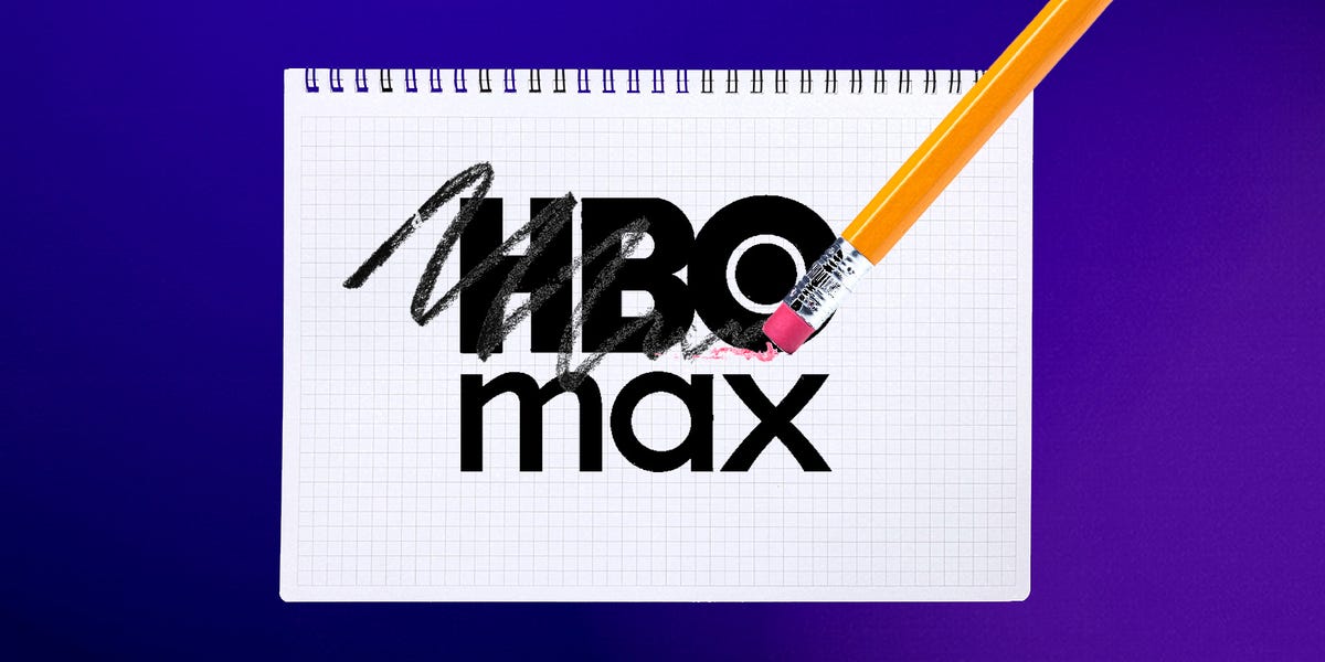
This latest rebrand is WBD’s clearest signal yet that it’s no longer trying to contend with Netflix and is instead prioritizing profitability.
WBD content chief Casey Bloys said putting the HBO brand front and center “far better represents our current consumer proposition,” and positions its content as differentiated and valuable.
HBO’s three letters stand for high-quality, prestige programming, said Dan Green, a professor and the director of entertainment industry management at Carnegie Mellon University.
“It’s hard to get attention, and HBO Max — you know what you’re getting,” Green said.
However, branding veteran Rosica said this move wasn’t necessary — and could backfire.
Rosica said Max already had high brand awareness, especially among younger audiences. Confusion could also emerge, as some consumers may wonder if reality TV shows from Discovery are going away, or if prices are changing.
“A lot of questions will come up that really can be avoided,” Rosica said.
Some ad execs said they doubted the rebrand would make a difference either way.
Mike McHale of Noble People said ads on WBD’s streamer are still too expensive compared to its peers, given it has an audience that he thinks is reachable elsewhere.
“People who watch ‘The Sopranos’ — they probably also watch ‘The Office.’ There isn’t an exclusive audience of people I feel like I’m missing when I leave them off buys,” McHale said.
No matter what WBD calls its streamer, Thaler pointed out that it won’t be able to retroactively change shortcut buttons on Roku remotes. Many of them still say “HBO Max” — albeit now in the wrong color.